10. Website, Range of Motion Fitness Business Series
 The vast majority of the marketing funnels for a Fitness Business should lead to the business’ website.
Sure, potential clients can find out basic information from social media, particularly Facebook and Instagram, but in the end, it’s the website they’ll go to in order to take the step of contacting you. And this should be the end result of the first stage of marketing – contact.
This means your website is a vital cog in the client conversion machine, and a suboptimal website will result in a leaky sales funnel. The website is one of the key targets of marketing for Range of Motion Business Mentoring clients.
So how will people get to your website?
The first method is via ‘organic traffic’ – where people search for keywords in a search engine like Google. Your website pops up as a result of their search and they click that link.
For example, ‘gym osborne park’.
Let’s deal with organic traffic first, because that will determine some of the aesthetics, content and functionality of your website.
So how can we maximise organic traffic? How can we create Search Engine Optimisation (SEO)?
The mysterious world of SEO has been much written about, with numerous tips, tricks and hacks all claiming to offer the ‘secret’ advice to push your website to the top of a Google search.
Only Google knows exactly what happens inside the black box of their search algorithms, but they do provide a guide of some ‘best practices’. This resource isn’t meant to be an in depth, comprehensive guide to SEO, but there is one very simple, very basic rule of thumb…
Give your potential clients the information they want.
Solve their problems. There’s nothing new here, in fact it mirrors one of the biggest pieces of advice we offer on marketing in general. Don’t just focus on what you DO (the service you provide), instead focus on the problems you SOLVE, the value you bring to people.
In their own guide to SEO, Google advices that “Creating compelling and useful content will likely influence your website more than any of the other factors discussed here”. They go on to advise that you should “Optimise content for your users, not search engines”. So the advice here is that if you focus too much on trying to ‘hack’ or ‘beat’ Google to achieve SEO, you may in fact be damaging your SEO.
In summary, create a website that is as user friendly as possible, with all the information they might be looking for.
In addition to organic traffic, most of the visitors to your website would come from organic social media and paid social media advertising campaigns, which we’ll cover later in this series.
So how do we start to build the website? This isn’t intended as a technical guide to the steps of website construction, but rather, a guide to what should be included, and the boxes you should tick to provide a valuable website.
And this is where we start – with a website that is valuable to our potential clients. By providing value we are able to increase the rates at which these potential clients make contact with us and progress to the next level of our sales funnel.
And the value we can provide to our clients isn’t demonstrated to them by your website just telling them what you do (though that’s important too), but by also telling them WHO you help, and the problems you solve. Because in the end, they’re coming to you to solve a problem, and they’re going to your website to find out if you’re the right person to solve their problem.
In Avatar Creation we explained that the external marketing process for your business should begin at the end. With the client. All too often, the marketing message of a business is ‘action-focussed’ – it tells people what you do. Instead, it should focus on the problems you solve.
Let’s begin with the landing page – the first place people go when they arrive at your website. Your landing page will fit in to one of two categories.
The first option for your landing page applies if you have a varied range of services. Now of course, although you may offer a varied range of services, what your potential client is actually interested in is how you can help THEM. How you can solve THEIR problems. So we have a challenge to overcome. How can we tell site visitors about all the different problems we can solve while still catering for the individual – who only needs one problem solving? We do this by using the landing page (for businesses offering wide and multiple services) as a place to ‘usher’ the site visitor to the area applicable to them. Just like the usher who directs you to your seat at a restaurant or event, the landing page will direct the visitor to the area of your site applicable to them (that will bring them value).
As Range of Motion fits in to this category of offering a wide range of services, you can see an example of this landing page type below and at rangeofmotion.net.au.
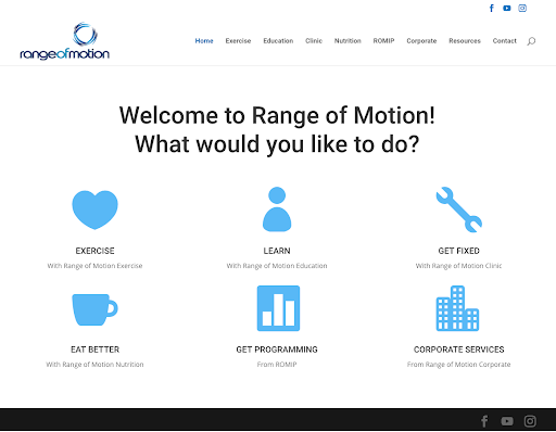
As you can see, instead of listing the things Range of Motion does (which may see the ‘Exercise’ button instead called ‘One-on-One Training’, the ‘Learn’ button replaced with ‘Articles, Courses and Mentorship’ and the ‘Get Fixed’ button replaced with ‘Exercise Rehabilitation’), the landing page focuses on what people will GET from Range of Motion, not what Range of Motion DOES.
The second option for your landing page is applicable to businesses who offer a single core service. Let’s say you offer Personal Training. Now sure, you offer a range of different options under this Personal Training umbrella, but your core service is clearly defined. For this type of business, we can remove the ‘usher’. To continue with our metaphor, this is like arriving at a restaurant with only one table. You know where you’re going to sit, so you don’t need to be guided to your table. The less steps on your website to get to this destination, the better, so for a single-service business, make this where they land when they first enter the site.
This landing page option also becomes the ‘secondary page’ for the multiple-service option we discussed above. It’s the place to which your usher delivers you.
There are several key criteria of this landing page (be it the primary or secondary page for your business).
The first thing to examine, is what is displayed ‘above the fold’? This is a marketing term left over from the days when newspapers where the primary source of media dispersal. The papers would be folded in half, with only the top half of the paper being visible on the shelf in the newsagents. Anything visible on this top half of the page, or ‘above the fold’ would be the deciding factor in whether or not someone would buy the paper. Your website is the same. What your site visitor sees when they first land on your website, without scrolling, will largely determine whether they continue through your sales funnel, or leave it.
- What you choose to put ‘above the fold’ is vitally important’. So what should we put there? The following should all be immediately visible above the fold:
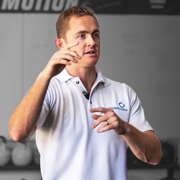
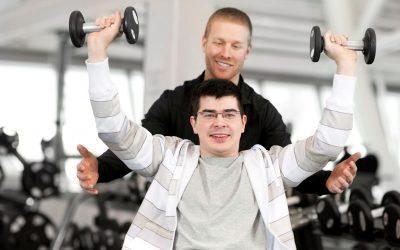
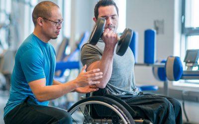
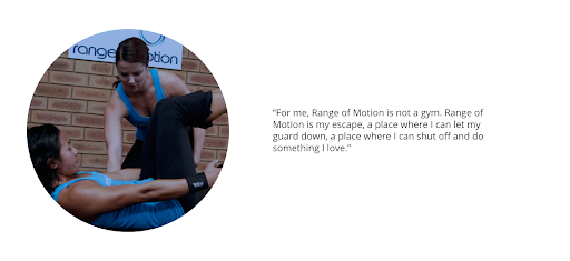
- There should be an image (that matches one of your key avatars) or a professionally created video. This imagery sets the tone for your client’s journey with you. A picture of you working (i.e. showing WHAT you do) with a client who matches one of your key avatars (i.e. showing WHO you work with) who looks healthy, happy and is smiling (showing WHY they should join you and the end result they can expect / the destination you’ll deliver them too / the problem you’ll solve) is perfect.
- There should be a short, clear body of text. Start with the end result in mind – the thing your potential clients wants from you, the thing they’ve been looking for, the problem you’ll solve. Then, tell them WHAT it is you do that solves this problem (this is your service and provides clarity about what the service is that you offer). Then, include a call to action. In the vast majority of cases, you want this call to action to be them contacting you.
- Finally, and still above the fold, you want to have a way for them to contact you. Keep this basic. The more detail and the more fields you have in this basic contact form, the higher the ‘friction’ and the less likely your potential client will complete (and submit) the contact form. Don’t just link to a contact page – this is another step the potential client would have to take, and therefore, another potential hole in your sales funnel.
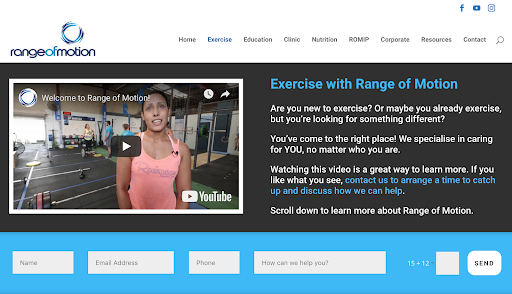
Take a look at an example of this type of landing page on the Range of Motion website at rangeofmotion.net.au/exercise.
Let’s move ‘below the fold’ – to the part of the website that involves scrolling.
In recent times, websites design has trended away from multiple short pages, to a smaller number of longer, scrollable pages. Web designers have discovered that by reducing the ‘friction’ and the need to navigate to multiple pages, we’re better able to keep site visitors engaged and on our site. The longer they spend there, the more likely they are to take action.
The first thing you should include below the fold is a way for your visitors to navigate to the different sections of that page. Clicking each of these links will jump them to an anchor on that same page to learn more.
For example, immediately below the fold on the Range of Motion website is:
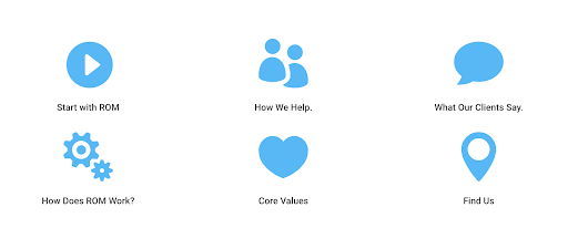
And this screenshot gives some clues as to what happens next. Obviously these categories are specific to the service Range of Motion provides (under the umbrella of our ‘Exercise’ branch), but they give you a good idea of what should be included.
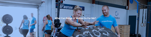
We have chosen to use image banners between each of these sections. These act not only for the visual appeal, but also to again emphasise what we do, and who we help. This is a design element we’ve chosen. Not compulsory, but we like it.
You can see screenshots of each of the areas of the page that these buttons link to below. You’ll notice we regularly include buttons for people to jump to the contact form on the bottom of the page so they can get in touch. Remember, making contact is the primary aim of the website – so ensure you give plenty of opportunities to do just that.
Start with ROM: This guides them through the process of becoming a client of Range of Motion. By revealing the path we make everything very clear and reduce any anxiety that may come from the ‘fear of the unknown’.
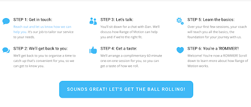
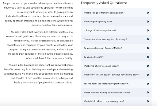
How Does ROM Work? This gives them an overview of the entire process that is the Range of Motion Experience. We also include frequently asked questions in this section.
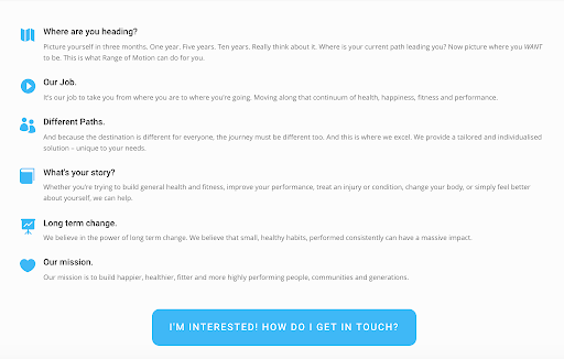
How We Help: Although this section is called ‘How We Help’, it actually takes them more into the ‘what’. ‘What’ we actually do to solve their problems.
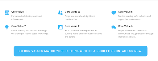
Core Values: Our Core Values are vitally important to us (learn about how to create your Core Values). They drive everything we do and are fundamental in creating our culture which defines the client experience. It’s important to us that our Core Values are displayed for all to see. If people resonate with our Core Values (and believe they match their own), they’re more likely to become clients and we get more of the sorts of people we want in our community. If you Core Values don’t match, it acts as a great barrier to the sorts of people we don’t believe will contribute to our culture.
What our Client Say: Social proof. Testimonials from our clients (who match our avatars) explaining the problems we’ve solved for them.
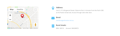
Find us: Although we also have a contact page, we want these details available to people without having to go looking for them.
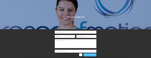
Then, at the bottom of EVERY page on the Range of Motion website, we have a contact form. All the ‘contact’ buttons on the website jump to this contact form. There’s a smiling face of one of our staff, and a place for them to leave their details, and, importantly, we ask them how we can help. Again, this drives home our emphasis on the fact that we ‘solve problems’ rather than ‘provide services’.
On the Range of Motion website, we follow this same template for all our secondary pages (one for each of the branches of our business), but for a business with less services, this single primary page will provide just about everything your potential clients need.
There are some other desired pages.
Create a blog or a place for you to post new content. This is a very important part of your content creation and distribution strategy (which will position you as an authoritative figure). The individual blog pages on the website will be the destination of your social media posts. Regularly updated and uploaded content will also allow you to improve your SEO. Now of course, if you’ve set up effective social media campaigns (particularly as related to content creation) people won’t always be arriving at your website through the front door. They’ll be arriving at the particular piece of content (in this case, a blog link) you’ve posted on social media or through other marketing avenues. So make sure on your blog pages, you’ve still got ways for your site visitors to contact you and navigate around your site. When writing blogs, include plenty of links to other areas of your site (including related blogs). Google likes it for SEO, and it will keep people on your site longer (again, making an action more likely).
Create a contact page. Even though there are multiple ways for people to contact you already throughout your site, people expect, and look for, a contact page. On this page, give them as many ways to contact you as possible (so they can choose their preference). Email, phone, webform, physical address (with Google Map) etc.
So now we know what your site should include, you need to create a ‘site map’, a big picture view of your website. This can be useful in organising your mind around the functionality and structure of your website.
We suggest a whiteboard is a great way to do this.
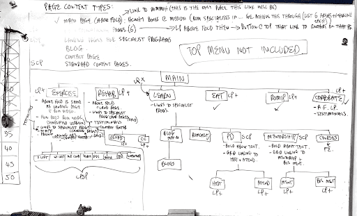
This is the site map for the Range of Motion website. It’s actually quite a simple site, but it’s more complex than most fitness businesses with a small number of service offerings.
A typical fitness business website would have a single landing page, a blog page and a contact page. 80% of everything you’ll ever need will be on one of those three pages.
Your menu should be similarly simple. It should always be displayed at the top of every page. Make sure your site visitor can access all pages at all times. Your menu should also include a prominent search function. People are conditioned to using ‘search’, so let them.
Of course, your website should be ‘mobile friendly’, so check it displays effectively on all screen sizes.
Your website is where you should be driving people. It’s the destination of your marketing. Make sure it makes people WANT to take action and makes it easy for them to take action. In the end, this is a vehicle to demonstrate the value you can bring them, and progress them through the sales funnel to the point they make contact.